Showing posts with label 2. Thesis. Show all posts

Wednesday, June 20, 2007

Third Draft

The Role of Blank Space in Typography


1. Introduction


People read materials in newspapers, magazines, the Internet, books, advertisements in their daily lives. These reading materials have various visual elements that depend on paper size, layout, color and typeface. These components help people to read and understand texts easily. However, when people read, they usually concentrate on the content in the text and it is not easy for casual eyes to notice the visual elements. Especially, blank space is also easily passed over. However, blank space is important in terms of the legibility, variety, and aesthetics of typography.

According to Boulton (2007), “whitespace is empty space” (para. 1). However, the meaning of blank space is not simply white space. Blank space sometimes has some color and although it does not look like it has any function, it can still be blank space. In typography, the blank space is between elements in composition. Through the elements, blank space gives legibility because the pertinent blank space in a good composition can lead readers’ eyes to follow contents comfortably and to find important information of contents easily. Thus, some elements are made to bring out readability. Donald points out the importance of this: “Lack of white space is as tiresome as the party blabbermouth. [On the other hand,] margins and white space beckon the reader in” (as cited in White, 2002, p29). Furthermore, appropriate blank space in a composition can create an aesthetic. In a similar vein, Boulton (2007) points out that more blank space is luxurious and less blank space is cheap (para. 4). This explains the relationship between blank space and the value of aesthetics. Having more blank space will look like high quality artwork and marvelously, this concept is related with a canon of Eastern aesthetics, especially Korea.


2. Blank Space with Legibility and Variety
- Empty space and elements in a composition


The composition between type elements and blank space is important in typography. This includ the space between words, text columns, paragraphs, lines, and characters. White (2002) explains in detailed that “The rules must be clear in both the use of white space and in the placement of elements in the white space. The use of too little white space results in an overfull page. On the other hand, the use too much white space makes a page or spread look incomplete, as if elements have slid off the page” (p. 23). This means that the lack of blank space can make difficult to read text because of overlapping or connecting letters, lines, paragraphs or columns on the one hand and on the other hand, the too much blank space, wasted space, can make people’s eyes lose direction. As the appropriate amount of blank space makes legibility, typographers always consider. Sometimes to communication more information, typographers need to reduce the amount of blank space but without making it difficult to read.


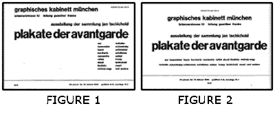
Likewise, using blank space in composition of content makes variety and legibility. Although it is the same content, it looks different and easy to understand according to the amount of blank space. As seen in Tschichold’s poster cards below, the two passages have the same content but those have a different amount of blank space. White (2002) explained abut the design of these examples by concentrating on symmetrical style of typography. Tschichold says about those two examples that “The content has been refitted to a symmetrical format to show how white space added quality to the communication.” (as cited in White, p,29).


In logo design, manipulating blank space skillfully is important because it can make more variety. Blank space can make people focus on logos or some massage that companies want to impact and communicate with people. Lindsay (2006) points out the blank space will look incomplete, but publishers have learned because blank space is like breathe, it gives freedom to their audience (para 3.10.). Also, Lindsay (2006) warns to fill available space with advertisement, in effect customers and advertisements will be driven away at the same time (para 12.). As seen in the examples below, the FedEx logo is famous for using blank space between letters. The FedEx logo shows how using blank space can affect people. Its designer, Leader (2004), used the “hidden” space between a capital “E” and a lower-case “x” to create an arrow. The view changes slightly from concentrating on letter design to observing the blank space. He realized the blank space and then chose the typeface to create a perfect arrow (para 7 ~9.).



3. Blank Space Speaks Itself
- Less blank space = cheap; more blank space = luxury


In the advertising of typography, like posters, the blank space is important to make look them expensive. Boulton (2007) explains “designers use whitespace to create a feeling of sophistication and elegance for upscale brands [by uaing] extensive whitespace in their marketing material to tell the reader that they are sophisticated, high quality, and generally expensive” (para 4.). When advertising in limited space, some companies decided the most important information is observed with blank space. Others just concentrate on giving much information to the reader with full space. However, White (2002) points out how it works in advertisement, that companies want to get a large space in newspapers to advertise and then they create blank space because they believe “empty speaks even more highly of the company’s success”(p. 29). This concept of blank space is similar with the meaning of blank space in Oriental aesthetics. According to Kim (2001) “the blank space, oneself, is not a just hollow one and it can be said that the blank space manifests the formation of a picture and the inner world of the painter through the formative consciousness like the essential elements of a picture” (p. II). It is that the blank space gives people the opportunity to interpret their own imagination about the blank space plentifully. It will be the same idea between Western and Oriental aesthetics.
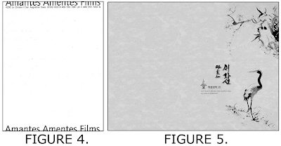


Those are posters designed by American artist and Korean artist. The two posters do not have many words. The left poster has the words “Amantes Amentes Films” with some information and the right poster has Oriental painting with Chinese and Korean characters. The layout of the posters is different but using blank space and posters’ edges is similar. It is the same that both are blank in the canter. The left poster uses edges of the top and bottom, and the right poster uses the edge of the right side. Those give an opportunity to audiences to understand blank space themselves. In addition, making blank space a lot in commercial posters represents the wealth because they have to give up the chance to use more colors, information, and visual impact instead of creating the blank space.


4. Conclusion

The blank space can be defined by white and empty space by a different expression according to different perspectives. The blank space may not look important, but it has function. The blank space creates a different view of the composition with the same contents and makes variety and legibility. Focusing on designing blank space makes fresh and successful results like the white arrow of the FedEx logo. In addition, in advertising, blank space makes a luxurious visual effect with more space that makes people have their own interpretation and less words that are the most important. It will impact people to keep the ideas longer than a fully designed space.

Blank space should have a relationship with full space because they fill the limited space on papers that are giving opportunities to typographers to express a lot of ideas and information. The role of various elements in typography are important, as well as the blank space but sometimes they are given up by the blank space because they should think about its role.


References

Boulton. M. (2007 Jan. 09). Whitespace. Retrieved May 31, 2007, from
http://alistapart.com/articles/whitespace

Kim. D.W. (2001. Oct.) The Spirit of Blank Space and the Formative Consideration in
the oriental Painting. Korea: National Assembly Library

Leader. L. (2004 Nov. 16). The Man Behind the FedEx Logo. Retrieved June 14, 2007,
from http://www.thesneeze.c om/mt-archives/000273.php

Lindsay. S. (2006 Oct. 23). Website Design: Welcome The White Space. Retrieved June 17, 2007 http://www.webpronews.com/expertarticles/2006/10/23/website-design-welcome-the-white-space

White. A. W. (2002). The Elements of Graphic Design. New York; Allworth Press. p23~29. Retrieved June 14, 2007, from http://www.chihwaseon.com/

Monday, June 18, 2007

Second Draft


The Role of Blank Space in Typography


1. Introduction

People read materials in newspapers, magazines, the Internet, books, advertisements in their daily lives. Those reading materials have various visualizations that are depend on several elements such as sizes of papers, layouts, colors and typefaces. Those components help people to read and understand texts easily. However, when people read some materials, usually they concentrate on reading the contents in texts to follow contents and it is not easy for casual eyes to notice about those elements. Especially, the blank space is not also easy to know. However, the blank space is importance in legibility, variety, and aesthetic in typography.

According to Boulton (2007), “whitespace is empty space” (para. 1). However, the meaning of blank space is not simply white space. Although the blank space has some color and it does not look any function, it can be blank space. In typography, the blank space is between elements in composition. Through the elements, the blank space gives them legibility because the pertinent blank space in a good composition can lead readers’ eyes to follow contents comfortably and to find good points of contents easily. Thus, when they have reading materials, some elements made bring out to them readability. Donald points out its importance; “Lack of white space is as tiresome as the party blabbermouth. [On the other hand,] margins and white space beckon the reader in” (as cited in White, 2002, p29). Furthermore, the appropriate blank space in composition can create aesthetic. In a similar vein, Boulton (2007) points out more blank space are luxury and less blank space is cheap (para. 4). It explains relationship between blank space and the value of aesthetic. Having more blank space will look like high quality artwork and marvelously, this concept related with a canon of East aesthetic especially Korea.

2. Blank Space with Legibility and Variety
- Empty space and elements in a composition

The composition between elements and blank space is important in typography. The elements are the space between words, text columns, paragraphs, lines, and characters. White (2002) explains detailed that “The rules must be clear in both the use of white space and in the placement of elements in the white space. The use of too little white space results in an overfull page. On the other hand, the use too much white space makes a page or spread look incomplete, as if elements have slid off the page” (p. 23). It explains that lack of blank space can make to read difficult as overlapping or connecting between letters or lines and paragraphs or columns and on the other hand, the overfull blank space, wasted space, can make people’s eyes lose to follow direction. As the appropriate blank space makes only legibility, typographers always consider about the propriety. Sometimes to give more knowledge, typographers need to reduce the amount of blank space but without the minimum of blank space nobody try to read.

Using blank space in composition of content makes variety and legibility. Although it is the same content, it looks different and easy to understand according to the amount of blank space. As seen in the examples below, the two passages have same contents but those have different amount of blank space. White (2002) explained abut Tschichold’s poster cards designed by concentrating symmetrical style of typography. Tschichold described about those two examples like that “The content has been refitted to a symmetrical format to show how white space added quality to the communication.” (as cited in White, p,29).


In the logo design, manipulating empty space skillfully blank space is more important because it can be make more variety. The blank space can make people focus on some logos or some massage which is companies want to impact and communicate with people. Lindsay (2006) points out the blank space will look incomplete but publishers have learned because blank space is like breathe (para 3.10.). Also, Lindsay (2006) warns to fill available space with advertisement, in effect customers and advertisements will be driving away at the same time (para 12.). As seen in the examples below, FedEx logo shows the successful logo that becomes famous to use blank space between letters. The FedEx logo shows how using blank space can affect to people. The FedEx logo designer, Leader (2004), used the “hidden” space between a capital “E” and a lower-case “x” to create arrow. It becomes small change of a view from concentrating letter design to observing the blank space. He realized the blank space and then chose the typeface to create perfect arrow well (para 7 ~9.).


3. Blank Space Speaks Itself
- Less blank space = cheap; more blank space = luxury

In the advertising of typography like posters, the blank space is important to make look expensive. Boulton (2007) explains “designers use whitespace to create a feeling of sophistication and elegance for upscale brands.” “...use extensive whitespace in their marketing material to tell the reader that they are sophisticated, high quality, and generally expensive (para 4.). When advertising in settled space, some companies decided the most important information to observe with blank space. Others just concentrate to give much information to reader with full space. However, White (2002) points out how it works in advertisement that companies want to get large space in newspapers to advertise and then they leaved blank space because they believe “empty speaks even more highly of the company’s success”(p. 29). This concept of blank space is similar with the meaning of blank space in oriental. According to Kim (2001) “the blank space, oneself, is not a just hollow one and it can be said that the blank space manifests the formation of a picture and the inner world of the painter through the formative consciousness like the essential elements of a picture” (p. II). It is that the blank space gives people opportunity to interpret their own imagination about the blank space plentifully. It will be same idea between western and oriental.

Those are posters designed by America and Korea. Two posters do not have many words. The left poster has the words “Amantes Amentes Films” with some information and the right poster has oriental painting with Chinese character and Korean character. The layout of posters is different but using blank space and posters’ edges is similar. It is same that blank in the center of both posters, the left poster used edges of top and bottom, and the right poster used edge of right side. Those give an opportunity to audiences to understand blank space themselves. In addition, making blank space a lot in commercial posters, it represents the wealth because they have to give up the chance of to use more colors, information, and visual impact instead of creating the blank space.


4. Conclusion

The blank space can be defined white and empty space as different expression according to different perspectives. The blank space may not look important, but it has function. The blank space creates different view of composition with same contents and makes variety and legibility. Focusing on design blank space makes fresh and successful result like the white arrow of FedEx logo. In addition, in advertising, blank space makes luxurious visual effect with more space that makes people have their own interpretation and less word that are the most important. It will give impact people to keep the ideas longer than designed full space.

Blank space should consider with full space because filled the limited space on papers that are given opportunities typographers to express a lot of ideas and information. The role of various elements in typography are important as well as the blank space but sometimes they are given up by the blank space because they should think about the role of blank space.


References

Boulton. M. (2007 Jan. 09). Whitespace. Retrieved May 31, 2007, from
http://alistapart.com/articles/whitespace

Kim. D.W. (2001. Oct.) The Spirit of Blank Space and the Formative Consideration in
the oriental Painting. Korea: National Assembly Library

Leader. L. (2004 Nov. 16). The Man Behind the FedEx Logo. Retrieved June 14, 2007,
from http://www.thesneeze.c om/mt-archives/000273.php

Lindsay. S. (2006 Oct. 23). Website Design: Welcome The White Space. Retrieved June 17, 2007 http://www.webpronews.com/expertarticles/2006/10/23/website-design-welcome-the-white-space

White. A. W. (2002). The Elements of Graphic Design. New York; Allworth Press. p23~29.

Retrieved June 14, 2007, from http://www.chihwaseon.com

First Revision


The Role of Empty Space in Typography


1. Introduction

People read some (delete) materials in newspapers, magazines, (the) Internet, books, advertisements in their daily lives. Those reading materials have various visualizations that are depending (depend) on several elements such as sizes of papers, layouts, colors and typefaces. Those (components) help people to read and understand (texts) easily. However, when people read some materials, usually they concentrate (on reading the contents in texts) to follow contents and it is not easy (for casual eyes) to notice about those elements. (Especially) Empty (not blank??) space is not also easy to know. However, the empty space is importance in legibility, variety, and aesthetic in typography.

Boulton (2007) defined (According to Boulton (2007), “whitespace is empty space” (para. 1). However, the meaning of empty space is not (simply) white space (.) because (delete, and start a new sentence, Although) although the empty space has some color, it does not look any function it can be empty space. In typography, the empty space is between elements in composition. Through the elements, the empty space gives them legibility because the pertinent empty space in a good composition can lead readers’ eyes to follow contents comfortably and to find good points of contents easily. Thus, when they have reading materials, some (elements? ) made (bring out to) them readability. Donald points out its importance; “Lack of white space is as tiresome as the party blabbermouth. [On the other hand,] margins and white space beckon the reader in” (as cited in White, 2002, p29). Furthermore, the appropriate empty space in composition can create aesthetic. Also,(In a similar vein,) Boulton (2007) point(s) out more empty space is luxury and less empty space is cheap (para. 4). It explains relationship between empty space and the value of aesthetic. Having more empty space will look like high quality artwork and marvelously, this concept related with a canon of East aesthetic especially Korea.

2. Empty Space with Legibility and Variety (From now, you will check the title format.)
- Empty space and elements in a composition

The composition between elements and empty space is important in typography. The elements are the space between words, between (I guess you’d better delete “between” but check with your writing tutor.) text columns, between paragraphs, between lines, and between characters. White (2002) explained (Yang Yi, Be consistent. Usually writers use present tense. You will check the rest of this paper on this.) detailed that “The rules must be clear in both the use of white space and in the placement of elements in the white space. The use of too little white space results in an overfull page. On the other hand, the use too much white space makes a page or spread look incomplete, as if elements have slid off the page” (p. 23). It explains that lack of empty space can make to read difficult as overlapping or connecting between letters or lines and paragraphs or columns and on the other hand the overfull empty space, wasted space, can make people’s eyes lose to follow direction. As the appropriate empty space only makes (makes only) legibility, typographers always consider about the propriety. Sometimes to give more knowledge, typographers need to reduce the amount of empty space but without the minimum of empty space nobody try to read.

Using empty space in composition of content makes variety and legibility. Although it is the same content, it looks different and easy to understand as (according to) the amount of empty space. In this examples (what is this? And check agreement between this and examples: as seen in the examples below, the two passages) have same contents but those have different amount of white space. White (2002) explained abut Tschichold’s poster cards designed by concentrating symmetrical style of typography. Tschichold described about those two examples like that “The content has been refitted to a symmetrical format to show how white space added quality to the communication.” (as cited in White, p,29).


In the logo design, to focus on (manipulating empty space skillfully) empty space is more important because it can be make more variety. The empty space can make people focus on some logos or some massage which is companies want to impact and communicate with people.(If you can, it is a good idea to include citations to make your argument stronger) Here is a good example to show the successful logo that becomes famous to use empty space between letters. The FedEx logo shows how using empty space can impact to people. The FedEx logo designer, Leader (2004), used the “hidden” space between a capital “E” and a lower-case “x” to create arrow. It becomes small change of a view from concentrating letter design to observing the empty space. He realized the empty space and then chose the typeface to create perfect arrow well (para 7 ~9.).


3. Empty space speaks itself
- Less empty space = cheap; more empty space = luxury

In the advertising of typography like posters, the empty space is important to make look expensive. Boulton (2007) explain “designers use whitespace to create a feeling of sophistication and elegance for upscale brands.” “...use extensive whitespace in their marketing material to tell the reader that they are sophisticated, high quality, and generally expensive (para 4.). When advertising in settled space, some companies decided the most important information to make observation with empty space. Others just concentrate to give much information to reader with full space. However, White (2002) points out how it works in advertisement that companies want to get large space in newspapers to advertise and then they leaved empty space because they believe “empty speaks even more highly of the company’s success”(p. 29). This concept of empty space is similar with the meaning of empty space in oriental. According to Kim (2001) “the blank space, oneself, is not a just hollow one and it can be said that the blank space manifests the formation of a picture and the inner world of the painter through the formative consciousness like the essential elements of a picture” (p. II). It is that the empty space gives people opportunity to interpret their own imagination about the empty space plentifully. It will be same idea between western and oriental.

Those are posters designed by America and Korea. Two posters do not have many words. The left poster has the words “Amantes Amentes Films” with some information and the right poster has oriental painting with Chinese character and Korean character. The layout of posters is different but using empty space and posters’ edges is similar. It is same that empty in the enter posters and the left poster used edges of top and bottom and the right poster used edge of right side. Those give an opportunity to audiences to understand empty space themselves. Also, making empty space a lot in commercial posters, it represents the wealth because they have to give up the chance of to use more colors, information, and visual impact instead of creating the empty space.


4. Conclusion

The empty space can be (defined) white space and blank space as different expression. (according to different perspectives.) The empty space is nothing (may not look important, ) but it has function. The empty space creates different view of composition with same contents and makes variety and legibility. Focusing to (on) design empty space makes fresh and successful result like the white arrow of FedEx logo. In addition, in advertising, empty space makes luxurious visual effect with more space which makes people have their own interpretation and less words which are the most important. It will give impact people to keep the ideas longer than designed full space.

Empty space should consider with full space because filled the limited space on papers that are given opportunities typographers to express a lot of ideas and information. The role of various elements in typography are important as well as the empty space but sometimes they are given up by the empty space because they should think about the role of empty space.

First Draft


The Role of Empty Space in Typography


1. Introduction

People read some materials in newspapers, magazines, Internet, books, advertisements in their daily lives. Those reading materials have various visualizations that are depending on several elements such as sizes of papers, layouts, colors and typefaces. Those help people to read and understand easily. However, when people read some materials, usually they concentrate to follow contents and it is not easy to notice about those elements. Empty space is not also easy to know. However, the empty space is importance in legibility, variety, and aesthetic in typography.

Boulton (2007) defined “whitespace is empty space” (para. 1). However, the meaning of empty space is not white space because although the empty space has some color, it does not look any function it can be empty space. In typography, the empty space is between elements in composition. Through the elements, the empty space gives them legibility because the pertinent empty space in a good composition can lead readers’ eyes to follow contents comfortably and to find good points of contents easily. Thus, when they have reading materials, some made them readability. Donald points out its importance; “Lack of white space is as tiresome as the party blabbermouth. [On the other hand,] margins and white space beckon the reader in” (as cited in White, 2002, p29). Furthermore, the appropriate empty space in composition can create aesthetic. Also, Boulton (2007) point out more empty space is luxury and less empty space is cheap (para. 4). It explains relationship between empty space and the value of aesthetic. Having more empty space will look like high quality artwork and marvelously, this concept related with a canon of East aesthetic especially Korea.


2. Empty space with legibility and variety
- Empty space and elements in a composition


The composition between elements and empty space is important in typography. The elements are the space between words, between text columns, between paragraphs, between lines, and between characters. White (2002) explained detailed that “The rules must be clear in both the use of white space and in the placement of elements in the white space. The use of too little white space results in an overfull page. On the other hand, the use too much white space makes a page or spread look incomplete, as if elements have slid off the page” (p. 23). It explains that lack of empty space can make to read difficult as overlapping or connecting between letters or lines and paragraphs or columns and on the other hand the overfull empty space, wasted space, can make people’s eyes lose to follow direction. As the appropriate empty space only makes legibility, typographers always consider about the propriety. Sometimes to give more knowledge, typographers need to reduce the amount of empty space but without the minimum of empty space nobody try to read.
Using empty space in composition of content makes variety and legibility. Although it is the same content, it looks different and easy to understand as the amount of empty space. In this examples have same contents but those have different amount of white space. White (2002) explained abut Tschichold’s poster cards designed by concentrating symmetrical style of typography. Tschichold described about those two examples like that “The content has been refitted to a symmetrical format to show how white space added quality to the communication.” (as cited in White, p,29).


In the logo design, to focus on empty space is more important because it can be make more variety. The empty space can make people focus on some logos or some massage which is companies want to impact and communicate with people. Here is a good example to show the successful logo that becomes famous to use empty space between letters. The FedEx logo shows how using empty space can impact to people. The FedEx logo designer, Leader (2004), used the “hidden” space between a capital “E” and a lower-case “x” to create arrow. It becomes small change of a view from concentrating letter design to observing the empty space. He realized the empty space and then chose the typeface to create perfect arrow well (para 7 ~9.).


3. Empty space speaks itself
- Less empty space = cheap; more empty space = luxury


In the advertising of typography like posters, the empty space is important to make look expensive. Boulton (2007) explain “designers use whitespace to create a feeling of sophistication and elegance for upscale brands.” “...use extensive whitespace in their marketing material to tell the reader that they are sophisticated, high quality, and generally expensive (para 4.). When advertising in settled space, some companies decided the most important information to make observation with empty space. Others just concentrate to give much information to reader with full space. However, White (2002) points out how it works in advertisement that companies want to get large space in newspapers to advertise and then they leaved empty space because they believe “empty speaks even more highly of the company’s success”(p. 29). This concept of empty space is similar with the meaning of empty space in oriental. According to Kim (2001) “the blank space, oneself, is not a just hollow one and it can be said that the blank space manifests the formation of a picture and the inner world of the painter through the formative consciousness like the essential elements of a picture” (p. II). It is that the empty space gives people opportunity to interpret their own imagination about the empty space plentifully. It will be same idea between western and oriental.


Those are posters designed by America and Korea. Two posters do not have many words. The left poster has the words “Amantes Amentes Films” with some information and the right poster has oriental painting with Chinese character and Korean character. The layout of posters is different but using empty space and posters’ edges is similar. It is same that empty in the enter posters and the left poster used edges of top and bottom and the right poster used edge of right side. Those give an opportunity to audiences to understand empty space themselves. Also, making empty space a lot in commercial posters, it represents the wealth because they have to give up the chance of to use more colors, information, and visual impact instead of creating the empty space.


4. Conclusion

The empty space can be white space and blank space as different expression. The empty space is nothing but it has function. The empty space creates different view of composition with same contents and makes variety and legibility. Focusing to design empty space makes fresh and successful result like the white arrow of FedEx logo. In addition, in advertising, empty space makes luxurious visual effect with more space which makes people have their own interpretation and less words which are the most important. It will give impact people to keep the ideas longer than designed full space.
Empty space should consider with full space because filled the limited space on papers that are given opportunities typographers to express a lot of ideas and information. The role of various elements in typography are important as well as the empty space but sometimes they are given up by the empty space because they should think about the role of empty space.


References

Boulton. M. (2007 Jan. 09). Whitespace. Retrieved May 31, 2007, from
http://alistapart.com/articles/whitespace

Kim. D.W. (2001. Oct.) The Spirit of Blank Space and the Formative Consideration in
the oriental Painting. Korea: National Assembly Library


Leader. L. (2004 Nov. 16). The Man Behind the FedEx Logo. Retrieved June 14, 2007,
from http://www.thesneeze.c om/mt-archives/000273.php


White. A. W. (2002). The Elements of Graphic Design. New York; Allworth Press.
p23~29


Retrieved June 14, 2007, from http://www.chihwaseon.com