Wednesday, June 20, 2007

Third Draft

The Role of Blank Space in Typography


1. Introduction


People read materials in newspapers, magazines, the Internet, books, advertisements in their daily lives. These reading materials have various visual elements that depend on paper size, layout, color and typeface. These components help people to read and understand texts easily. However, when people read, they usually concentrate on the content in the text and it is not easy for casual eyes to notice the visual elements. Especially, blank space is also easily passed over. However, blank space is important in terms of the legibility, variety, and aesthetics of typography.

According to Boulton (2007), “whitespace is empty space” (para. 1). However, the meaning of blank space is not simply white space. Blank space sometimes has some color and although it does not look like it has any function, it can still be blank space. In typography, the blank space is between elements in composition. Through the elements, blank space gives legibility because the pertinent blank space in a good composition can lead readers’ eyes to follow contents comfortably and to find important information of contents easily. Thus, some elements are made to bring out readability. Donald points out the importance of this: “Lack of white space is as tiresome as the party blabbermouth. [On the other hand,] margins and white space beckon the reader in” (as cited in White, 2002, p29). Furthermore, appropriate blank space in a composition can create an aesthetic. In a similar vein, Boulton (2007) points out that more blank space is luxurious and less blank space is cheap (para. 4). This explains the relationship between blank space and the value of aesthetics. Having more blank space will look like high quality artwork and marvelously, this concept is related with a canon of Eastern aesthetics, especially Korea.


2. Blank Space with Legibility and Variety
- Empty space and elements in a composition


The composition between type elements and blank space is important in typography. This includ the space between words, text columns, paragraphs, lines, and characters. White (2002) explains in detailed that “The rules must be clear in both the use of white space and in the placement of elements in the white space. The use of too little white space results in an overfull page. On the other hand, the use too much white space makes a page or spread look incomplete, as if elements have slid off the page” (p. 23). This means that the lack of blank space can make difficult to read text because of overlapping or connecting letters, lines, paragraphs or columns on the one hand and on the other hand, the too much blank space, wasted space, can make people’s eyes lose direction. As the appropriate amount of blank space makes legibility, typographers always consider. Sometimes to communication more information, typographers need to reduce the amount of blank space but without making it difficult to read.


Likewise, using blank space in composition of content makes variety and legibility. Although it is the same content, it looks different and easy to understand according to the amount of blank space. As seen in Tschichold’s poster cards below, the two passages have the same content but those have a different amount of blank space. White (2002) explained abut the design of these examples by concentrating on symmetrical style of typography. Tschichold says about those two examples that “The content has been refitted to a symmetrical format to show how white space added quality to the communication.” (as cited in White, p,29).
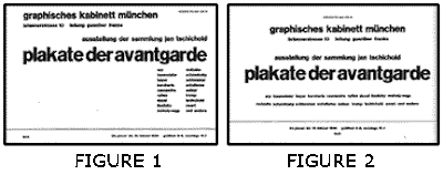


In logo design, manipulating blank space skillfully is important because it can make more variety. Blank space can make people focus on logos or some massage that companies want to impact and communicate with people. Lindsay (2006) points out the blank space will look incomplete, but publishers have learned because blank space is like breathe, it gives freedom to their audience (para 3.10.). Also, Lindsay (2006) warns to fill available space with advertisement, in effect customers and advertisements will be driven away at the same time (para 12.). As seen in the examples below, the FedEx logo is famous for using blank space between letters. The FedEx logo shows how using blank space can affect people. Its designer, Leader (2004), used the “hidden” space between a capital “E” and a lower-case “x” to create an arrow. The view changes slightly from concentrating on letter design to observing the blank space. He realized the blank space and then chose the typeface to create a perfect arrow (para 7 ~9.).



3. Blank Space Speaks Itself
- Less blank space = cheap; more blank space = luxury


In the advertising of typography, like posters, the blank space is important to make look them expensive. Boulton (2007) explains “designers use whitespace to create a feeling of sophistication and elegance for upscale brands [by uaing] extensive whitespace in their marketing material to tell the reader that they are sophisticated, high quality, and generally expensive” (para 4.). When advertising in limited space, some companies decided the most important information is observed with blank space. Others just concentrate on giving much information to the reader with full space. However, White (2002) points out how it works in advertisement, that companies want to get a large space in newspapers to advertise and then they create blank space because they believe “empty speaks even more highly of the company’s success”(p. 29). This concept of blank space is similar with the meaning of blank space in Oriental aesthetics. According to Kim (2001) “the blank space, oneself, is not a just hollow one and it can be said that the blank space manifests the formation of a picture and the inner world of the painter through the formative consciousness like the essential elements of a picture” (p. II). It is that the blank space gives people the opportunity to interpret their own imagination about the blank space plentifully. It will be the same idea between Western and Oriental aesthetics.
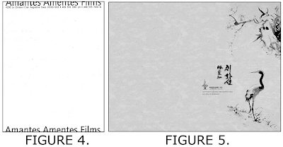


Those are posters designed by American artist and Korean artist. The two posters do not have many words. The left poster has the words “Amantes Amentes Films” with some information and the right poster has Oriental painting with Chinese and Korean characters. The layout of the posters is different but using blank space and posters’ edges is similar. It is the same that both are blank in the canter. The left poster uses edges of the top and bottom, and the right poster uses the edge of the right side. Those give an opportunity to audiences to understand blank space themselves. In addition, making blank space a lot in commercial posters represents the wealth because they have to give up the chance to use more colors, information, and visual impact instead of creating the blank space.


4. Conclusion

The blank space can be defined by white and empty space by a different expression according to different perspectives. The blank space may not look important, but it has function. The blank space creates a different view of the composition with the same contents and makes variety and legibility. Focusing on designing blank space makes fresh and successful results like the white arrow of the FedEx logo. In addition, in advertising, blank space makes a luxurious visual effect with more space that makes people have their own interpretation and less words that are the most important. It will impact people to keep the ideas longer than a fully designed space.

Blank space should have a relationship with full space because they fill the limited space on papers that are giving opportunities to typographers to express a lot of ideas and information. The role of various elements in typography are important, as well as the blank space but sometimes they are given up by the blank space because they should think about its role.


References

Boulton. M. (2007 Jan. 09). Whitespace. Retrieved May 31, 2007, from
http://alistapart.com/articles/whitespace

Kim. D.W. (2001. Oct.) The Spirit of Blank Space and the Formative Consideration in
the oriental Painting. Korea: National Assembly Library

Leader. L. (2004 Nov. 16). The Man Behind the FedEx Logo. Retrieved June 14, 2007,
from http://www.thesneeze.c om/mt-archives/000273.php

Lindsay. S. (2006 Oct. 23). Website Design: Welcome The White Space. Retrieved June 17, 2007 http://www.webpronews.com/expertarticles/2006/10/23/website-design-welcome-the-white-space

White. A. W. (2002). The Elements of Graphic Design. New York; Allworth Press. p23~29. Retrieved June 14, 2007, from http://www.chihwaseon.com/

Paraphrase

Paraphrase the following passages taken from a news article about Daniel Edwards.

Edwards added that the new piece was intended as a public service announcement to promote a safe attitude toward alcohol. "It is not really done out of humor," Edwards said. "When you're trying to engage young people you have to find a more powerful way to do it then what's on TV right now."


My paraphrase

Monday, 4 June 2007, 12:47 PM

According to Edwards, the behavior of alcohol is seriously problem in young people. Thus, he put this idea in his artwork to announce because he thought to reach to young people we need more stimulated way then TV shows us.

Reflection of Whole Course


Three different styles of writing, chatting, and online discussion will include the basic skills such as speaking, reading, writing, and listening and I learned these basic skills unusual way in this semester.

During the short time, I learned many things from my teacher and classmates. We enjoyed to chatting in the internet in class or at home to discuss and share some specific topics. Especially, sharing some information helped me to organize my topic of writing. Through this activity, I leaned the process of thinking and the expression of telling quickly. After online discussion, I could get my self evaluation through the transcripts. It was very uncommon way to learn English but it tough a lot of things.

I experienced the responsibility of my writing through studying plagiarism. It made me rethink about the process of writing and how I could write my own opinion. Thus, I had to research a lot before I wrote some topics and researching sources made me spend more time then writing. Sometimes I felt difficulty but it made my writing logically and academically. Through this process, also, my reading skill was improved because I had to read a lot of books and articles.

In this semester, I experienced a lot to improve my English skills. It was very short time and it gave me hard time but now I am proud to finish all of this process myself. It will be help me in my future thesis and discussion in my major class.

Tuesday, June 19, 2007

Reflection about Writing


About Three Style of Writings

During this short time, I experienced various things to learn and improve my English skill. The most challenge part was three different style of writing which is research paper about the Simpsons, thesis about my major and artistic statement about me.

Among these, research paper and thesis are required over 6 pages and it is not easy to me because I never write over 6 pages even Korean. Thus, to write over 6 pages, I had to research and read a lot of materials. Thus, before writing, I had to spend time to prepare my sources. To find appropriate sources, I took long times. Thus, I improved my reading skill to understand and summary to support my own theme. Also, I realized that to make good organization in long pages of writing, introduction and conclusion are very important to remind whole concept.

The research paper, The Simpsons, was interested to me and enjoyed because to write about the Simpsons, I had to show and discuss the episodes. Also, this has a lot of sources for my subject. Thesis looks similar with research paper but it is more academic paper. The topic was very fresh so I had difficulty to collect some supporting materials.

However, the artistic statement did not need some sources because the best source is I. To make good artistic statement has to keep the balance between biography and concept.
After writing the long papers, I was proud myself. These will help to write my thesis in my department. Also, to learn artistic statement is good chance to me because someday, it will explain about me. During 6 weeks, to finish these writings, I improved my writing skill with various style of writing.

Pablo Picasso - Les Demoiselles d'Avignon

Pablo Picasso - Les Demoiselles d'Avignon


Listening & Summarizing


1. Listening to a description:

While you are listening to the interview, jot down specific information (e.g., names, terms, dates, events…) that you think is important for you to understand these art works.

1907, 5 native women, illusion of their real body, simplified lines, plat sprint of colors, striate diagrammatic shape, a piece of melon – crescent moon, boomerang shape – hand or a piece of melon, curtain – sharp glass

2. Listening to a commentary description:

While you are listening to the narration, job down the most important information. After that, summarize what you have listened.

The speaker talked about background of title, composition, women’s feature, and the view point of audience. He explained the meaning and importance of this painting in that and this time. Further more he suggested how people can see and understand this painting and Picasso.

3. Take note activities

While you are listening to this recording, take notes whatever you think is important.

Turn 100 years, angularity & shocking, discomposing, absorb & challenging(1907), Cubism, changing everything, coincident composition


http://www.npr.org/templates/story/story.php?storyId=7708283

4. More listening activities

While you are listening this interview, find out two most important facts about Les Demoiselles d'Avignon.

1. He was looking at African sculpture and Arabic art before he drew this.
2. He created multiple perspectives which have complete different perspectives in one painting.

http://redstudio.moma.org/interviews/behind/#

Individual Teaching


Third Draft

Who Can Be the Real Audience of the Simpsons?


1. Introduction

The Simpsons is one of the most successful and popular animations in the world and so, the Simpsons movie will open in sixty-four countries on July 27 (simpsonsmovie.com. 2007). The reason for its popularity is the Simpsons deals with not only very fun topics and various stories and characters but also has a broad range of audiences. Nowadays, many adults like to see TV animations. Walker points out the reasons why adults like the Simpsons is that “it is a cartoon but it is not just for kids; it is very humorous to adults as well” (newnet.org.uk). Actually, according to Desowitz (2002), a third of animation’s audiences are adults and many parents are watching TV animations with their kids to have fun because they just want to feel like kids.

It becomes that the animations’ directors have wanted to be satisfied with a broad range of audiences such as men and women and preschoolers, teenagers, and adults. Thus, most of the subject matter of the jokes is not easy to understand for kids and so adults and kids laugh differently about the scenes.

Children cannot understand the Simpsons fully and sometimes they are influenced badly by mimicking without judgment. Thus, the Simpsons is not proper for children. For example, everyone including adults will laugh at some simply fun or ludicrous acts but adults will only laugh at some sarcastic stories. Furthermore, sometimes, parents will realize that some of the topics of the Simpsons are not fit for their kids and they worried about the influence of TV animations because of sexuality, violence, impoliteness, and wrong prejudice. However, the time schedule of the Simpsons is 6:30 to 7:30 P.M. Mon. to Fri. on FOX television broadcast and the rating of the Simpsons is TV-PG, TV Parental Guidelines, which means children need their parents’ guidelines when they watch TV (tvguidelines.org). However, it is questionable how many children have watched the Simpsons with their parents every weekday and if children should be allowed to watching the Simpsons.


2. The Bad Influence On Children’s Behavior And Eating Habits

The Simpsons has mainly five characters, father Homer, mother Marge, son Bart, daughter Lisa, and youngest kid Maggie and those are typical characters expected to observe in ordinary American families. Among the characters, Bart always makes some trouble in his elementary school with uncommon behaviors and says negative things for example, he starts to answer with “I will not…”(worldwide-web.com). Thus, Bart is awkward and not a good model character for kids because Bart’s behaviors are described violently and abnormally. For example, in the episode “Please Homer Don't Hammer'Em,” Bart jeers at and fights with his principal Skinner by attacking Skinner’s allergy and in the beginning of the episode “Jazzy and the Pussycats,” Bart goes to a funeral service but Bart plays with a laser beam and ball without seriousness. Those scenes will give children wrong ideas about respecting elder people. However, children will be looking at this character carefully because Bart has similar age, habits, and lifestyle with them. Although those scenes exist to give people humor, children adapt in a different way and they will act directly in their real lives. As they have seen several times, they gradually adapt and imitate those behaviors unconsciously. About this problem, Drake (2002) points out “Parents who aren't careful will find … Bart Simpson… as the role models chosen by their children.” and even teenagers learn secondary characteristics such as clothing behaviors and mannerisms from television.

The other problem is food diet for children. Homer is explained like “comic heroes like doughnut loving Homer” (Myers, 2005). It implies that children have followed eating doughnuts like Homer. Actually, British parents are afraid of the effect of unhealthy food habits in cartoon heroes to their children and 59 percent of parents thought the character Homer Simpson promoted to viewers unhealthy lifestyle (Myers, 2005). Obviously, in the scenes in episode “Ice Cream of Margie,” Homer likes ice cream and he has a new job that is selling ice cream with ice cream truck. Homer knew the ice cream is harmful for children but Homer does not stop to selling rather he pushes children to eat ice cream. The other episode “Moe 'N' A Lisa” shows Homer driving while sipping alcohol when Homer is going to literary conference with his family and Moe. Thus, Homer goes and stops his car depending on the sipping and stopping of alcohol. It is just a source of humor but it is dangerous to educate children. According to Cochran (2004) “The Simpsons has the ability to open the table up for discussion on a wide range of issues revolving around the Food and Drug Administration, and has done so over the past fifteen years with humor and style.” However, children cannot understand the deep meaning of the stories and they just misunderstand and accept visual scenes. Thus, the Simpsons is not for kids.


3. Why Do Many Adults Like To Watch the Simpsons?

How many adults are watching The Simpsons? According to West (2006) the Simpsons is the favorite cartoon to parents as 23 percent because of parenting skills, slapstick comedy and the hidden meaning. It is that the Simpsons not only just giving people humor but also has some message. Furthermore, the messages are only comprehended by parents because the Simpsons is mimicking live-action representation so they can relate to the characters and the story lines with their real lives (people.co.uk). Some funny scenes also have sarcastic stories. Sometimes, it solves their problem and relieves their lives through the Simpsons. For example, in the episode “Ice Cream of Marge,” Homer has changing his job to an ice cream seller because he likes ice cream. It makes parents rethink about role of fathers especially responsibility of family. Every father would think about leaving or changing their job when they face some trouble but it is difficult to leave or change their jobs in the real world because of their family. However, Homer can do it instead of them in the cartoon. Otherwise, the other episode “Homer Don't Hammer'Em” and “Ice Cream of Marge” shows that Marge realized her talent and struggles with her environment. It makes to reminds women what the position of women’s lives is as mothers. Some women will have their own job and they will have similar experience in their workspaces. Others will stay at home to care for their family but they will dream of having jobs instead of housework like Marge. Likewise, parents sympathize fully with several issues as compare their real lives. The Simpsons connects with their audiences, adults and it is one of the successful reasons.


4. The Simpsons Is No More For Children

Usually, children possessed the TV animations but recently TV animations have been rediscovered. Especially, the Simpsons is no more for children’s exclusive possession because the Simpsons describes American’s daily episodes with realistic family and the social issues with humorous happenings. Thus, when adults watch the Simpsons, they will realize the Simpsons reflects their lives using different images. In order to have fun, the behaviors of characters look silly and sarcastic social issues are described violently, foolishly, and simply, but not all understand the hidden joke and the whole meaning of stories. Thus, it is possible that these elements and expressions make children misunderstand and give bad influences such as food diet and behaviors of character. Otherwise, adults, the real audiences, can enjoy the obvious jokes and the visual sight gags like kids. They also can solve their stress from their society and get a challenge from the Simpsons. In fact, Lisa already said about who the real audiences of cartoons are in the episode "Krusty Gets Busted"(1989); "If cartoons were meant for adults, they'd put them on in prime time." In addition, Horowitz (2000) explained about that “Its ability to connect to its audience - mostly “adults,” as Lisa so astutely pointed out. “The Simpsons” is a sitcom meant for adults. It's meant for the educated, the intellectual, the pop culture-conscious.”


References

Cochran, J. D. (2004, April 27). “Mmmm... Pistol Whip”: An Exploration of Food, Drugs, and Medical Devices in The Simpsons. Retrieved. June 11, 2007, from http://leda.law.harvard.edu/leda/data/652/Cochran_redacted.html

Desowitz, B. (2002). Age Rage: Who’s Really Watching TV Animation? Animation Magazine 16 no4, 24-32, 36, 40

Drake, S. (2002, June 7). Psychologist Warns of TV's Negative Influence. Retrieved June 9,2007,
from http://www.pittsburghlive.com/x/pittsburghtrib/s_75258.html

Horowitz, J. (2000, April 21). A study of the audience of "The Simpsons." Retrieved June 9, 2007, from http://www.snpp.com/other/papers/jh.paper.html

Kogen, J. & Wolodarsky, W.(Writer), Bird, B.(Director).(1989) Krusty Gets Busted [Television series episode]. In Sakai. R (Producer), First Series. Twentieth Century Fox Film Corporation

Myers, J. (2005, Aug 14). TV Heroes Need A Health Make-over, Even They Influence Children's Diet. Retrieved June 9, 2007, from http://www.earthtimes.org/articles/show/3797.html

Walker, K. Why Are The Simpsons So Successful. http://www.newnet.org.uk/karlw/simpsons.html.

Warburton, M. (Writer) & Kirkland. M. (Director). (2006). Ice Cream and Marge [Television series episode]. In Greaney. D (Producer), Eighteenth Series. Twentieth Century Fox Film Corporation

Warburton, M. (Writer), & Kirkland, M. (Director). (2006). Please Homer Don't Hammer 'Em [Television series episode]. In Greaney. D (Producer), Eighteenth Series. Twentieth Century Fox Film Corporation

Warburton, M. (Writer), & Kirkland, M. (Director). (2006). Moe 'N' A Lisa [Television series episode]. In Greaney. D (Producer), Eighteenth Series. Twentieth Century Fox Film Corporation

Warburton, M. (Writer), & Kirkland, M. (Director). (2006). Jazzy and The Pussycats [Television series episode]. In Greaney. D (Producer), Eighteenth Series. Twentieth Century Fox Film Corporation

West, A. (2006, July 2). Simpsons Is Parents’ Favourite. Retrieved June 9, 2007, from
http://www.people.co.uk/news/tm_objectid=17321663&method=full&siteid=93463&headline=simpsons-is-parents--favourite--name_page.html

Retrieved June 9, 2007, from http:// www.simpsonsmovie.com

Retrieved June 9, 2007, from http:// http://www.newnet.org.uk/

Retrieved June 9, 2007, from http:// http://www.tvguidelines.org/

Retrieved June 11, 2007, from
http://www.worldwide-web.com/JeffreyBabad/Simpsons/Bart/index.html

Reflection Of Chatting And Video


About Chatting

1.Read the transcripts of Chats regarding the Simpsons. What did you do very well?

→ Onetime, I was a leader with Tea Yoon, so I prepared material to give my classmate topics. Usually, I just showed my opinion with my specific example.

2.What do you think you should have improved more to participate in this chat better than you actually did.

→ The word order and tense. Some question was changed the order like subject and verb with question mark. The tense is the most problem for my speaking because I like to use present tense. So when I have to use past tense, I made mistake easily. As a leader, some times I missed answer to my classmates. I should have to concentrate more their opinion and give direct answer.

3.What did you learn about learning English after participating in this chat and reading the transcripts?

→ When I get some interesting subject, I talked a lot but if some topic is not interested in, I do not want to show my opinions. It will be same with everyone but I have to practice to show my participation. However, I have a lot of spelling errors which are usually I did. I made some sentences which is different from my normal speaking. I mean it is close the writing.

About Video

1.Watch the video regarding the Simpsons. What did you do very well?

→ My participation is good in this discussion. I tell my opinion fully and I heard my classmates’ opinion.

2.What do you think you should have improved more to participate in this inclass discussion better than you actually did.

→ Sometimes, my speaking too slow and I skipped the ending of words. Also, I should use past tense but I am just use present tense. It did not notice about that well so I will concentrate about my tense. Also, my intonation is not natural and when I was talking two sentences I did not use various conjunction and transition word. Thus, sometimes, it makes my opinion not clear and understanding. However, I talked a lot inclass discussion better then my daily life and I got many feedbacks form this.

3.What did you learn about learning English after participating in this discussions and watching the video again?

→ To speak a lot is difficult for me because I always want to say perfectly so I thought a lot before I talk something. However, in this case, I had time limitation and some topic is so interested to me. Thus I tried to talk a lot quickly. However, sometimes, to show my opinion is difficult but I tried to say something and it makes me learned because when I say something, my other classmates usually gave me feedback.

Compareing Chatting And Video

1. Let’s compare the two different communication media, face-to-face discussions and online-instant discussions. Which one made you feel confident in your communication skills? Why?

→ Although to write is easier to me then speaking, through those two styles, I found I can do speaking more confidently.

2. Let’s compare the two different communication media, face-to-face discussions and online-instant discussions. Which one better helped you complete your research papers regarding the Simpsons? Why?

→ To compare two different communication media, I got a more information through speaking. When I was talking, I could reorganize my themes faster then chatting. Because I can get and give feedback my classmates at the same time, I can make my themes clearly.

3. In the future, if you were given the two choices, between chat and face-to-face discussion as part of your class work, which one will you choose? Why?

→ I think both of them is good for international students because students will have some evidence about discussion through video and transcript. It will help them to revise their speaking skill and give some feedback themselves. Through the video they will try to speak like native speakers with their intonations and pronunciations. Also, the chatting gives them some confidence to speak and organize their idea.

Second Draft


Who Can Be Real Audiences of the Simpsons?


1. Introduction

The Simpsons is one of the successful and popular animations in the world and so, the Simpsons movie will open in sixty-four countries on July 27 (simpsonsmovie.com. 2007). The reason for its popularity is the Simpsons deals with not only very fun topics and various stories and characters but also has a broad range of audiences. Nowadays, many adults like to see TV animations. Walker points out the reasons of which adults like Simpsons that “it is a cartoon but it is not just for kids; it is very humorous to adults as well” (newnet.org.uk). Actually, according to Desowitz (2002), a third of animation’s audiences are adults and many parents are watching TV animations with their kids to get fun because they just want to feel like kids.

It becomes that the animations’ directors have wanted to be satisfied with a broad range of audiences such as men and women and preschoolers, teenagers, and adults. Thus, the most subject matter of joke is not easy to understand for kids and so adults and kids laugh differently about the scenes.

Children cannot understand the Simpsons fully and sometimes they are influenced badly by mimic without judgment. Thus, the Simpsons is not proper for children. For example, everyone includes adults will laugh some simply fun or ludicrous acts but adults will only laugh at some sarcastic stories. Furthermore, sometimes, parents will realize that some of topics of the Simpsons are not fit for their kids and they worried about the influence of TV animations because of sexuality, violence, impoliteness, and wrong prejudice. However, the time schedule of the Simpsons is six thirty to seven thirty P.M. through Mon. to Fri. in FOX television broadcast and the rating of the Simpsons is TV-PG, TV Parental Guidelines, which means children need their parents’ guidelines when they watch TV (tvguidelines.org). However, it is wondering how many children have watched the Simpsons with their parents every weekday and children should be allowed watching the Simpsons.


2. The Bad Influence On Children Behavior And Eating Habit

The Simpsons has mainly five characters, father Homer, mother Marge, son Bart, daughter Lisa, and youngest kid Maggie and those typical characters expected to observe in ordinary American families. Among the characters Bart always makes some trouble in his elementary school with uncommon behaviors and says negative way for example, he starts to answer with “I will not…”(worldwide-web.com). Thus, Bart is awkward not a good model character for kids because Bart’s behaviors are described violently and abnormally. For example, in the episode “Please Homer Don't Hammer'Em,” Bart jeers at and fights with his principal Skinner by attacking Skinner’s allergy and in the beginning of episode “Jazzy and the Pussycats,” Bart goes a funeral service but Bart plays with beam and ball without seriousness. Those scenes will give children wrong ideas about respect elder people. However, children will be looking this character carefully because Bart has similar age, habits, and lifestyle with them. Although those scenes exist to give people humor, children adapt different way and they will act directly in their real lives. As they have seen several times, they gradually adapt and imitate those behaviors unconsciously. About this problem, Drake (2002) points out “Parents who aren't careful will find … Bart Simpson… as the role models chosen by their children.” and even teenagers learn secondary characteristics such as clothing behaviors and mannerisms from television.

The other problem is food diet for children. Homer is explained like “comic heroes like doughnut loving Homer” (Myers, 2005). It implies that children have followed eating doughnuts like Homer. Actually, in British parents afraid of the effect of unhealthy food habits in cartoon heroes to their children and 59 percent of parents thought the character Homer Simpson promoted to viewers unhealthy lifestyle (Myers, 2005). Obviously, in the scenes in episode “Ice Cream of Margie,” Homer likes ice creams and he has a new job that is selling ice creams with ice cream truck. Homer knew the ice creams are harmful for children but Homer does not stop to sell rather than exacts to eat ice creams to children. The other episode “Moe 'N' A Lisa” show Homer drives with shipping alcohol when Homer is going to literary conference with his family and Moe. Thus, Homer does going and stopping his car depending on the shipping and stopping alcohol. It is just a source of humor but it is dangerous to educate children. According to Cochran(2004) “The Simpsons has the ability to open the table up for discussion on a wide range of issues revolving around the Food and Drug Administration, and has done so over the past fifteen years with humor and style.” However, children cannot understand those deep meaning of the stories and they just misunderstand and accept visual scenes. Thus, the Simpsons is not kids’ monopolies.


3. Why Many Adults Like To Watch the Simpson?

How many adults are watching The Simpsons? According to West (2006) the Simpson is the favorite cartoon to parents as 23 percent because parenting skill, slapstick comedy and the hidden meaning. It is that the Simpsons not only just give people humor but also has some massage. Furthermore, the massages are only comprehended parents because the Simpsons is mimic live-action representation so they can relate to the characters and the story lines with their real lives (people.co.uk). Some funny scenes also have sarcastic stories. Sometimes, it solves their problem and relieves their lives through the Simpsons. For example, in the episode “Ice Cream of Marge,” Homer has changing his job to ice cream seller because he likes ice cream. It makes to rethink about role of fathers especially responsibility of family. Every father would think about leaving or changing their job when they face some trouble but it is difficult to leave or change their jobs in the real world because of their family. However, Homer can do instead of them in the cartoon. Otherwise, the other episode “Homer Don't Hammer'Em” and “Ice Cream of Margie” shows Marge realized her talent and struggles with her environment. It makes to remind what the position of women’s lives is as mothers. Some of women will have their own job and they will have similar experience in their workspaces. Others will stay at home to care their family but they will dream to become having their jobs instead of housework like Marge. Likewise, parents sympathize fully with several issues as compare their real lives. The Simpsons connects with their audiences, adults and it is the one of the successful reason.


4. The Simpsons Is No More For Children

Usually, children possessed the TV animations but recently TV animations rediscovered. Especially, the Simpsons is no more for children’s exclusive possession because the Simpsons describes American’s daily episodes with realistic family and the social issues with humorous happenings. Thus, when adults watch the Simpsons, they will realize the Simpsons reflects their lives using the different images. In order to having a fun, the behaviors of characters look silly and sarcastic social issues describe violently, foolishly, and simply, but not all understands the hidden joke and the whole meaning of stories. Thus, it is possible that this elements and expression make children misunderstand and give bad influences such as food diet and behaviors of character. Otherwise, adults, the real audiences, can enjoy the obvious jokes and the visual sight gags like kids. They also can solve their stress from their society and get a challenge from the Simpsons. In fact, Lisa already said about who the real audiences of cartoons are in the episode "Krusty Gets Busted"(1989); "If cartoons were meant for adults, they'd put them on in prime time." In addition, Horowitz (2000) explained about that “Its ability to connect to its audience - mostly “adults,” as Lisa so astutely pointed out. “The Simpsons” is a sitcom meant for adults. It's meant for the educated, the intellectual, the pop culture-conscious.”


References

Cochran, J. D. (2004, April 27). “Mmmm... Pistol Whip”: An Exploration of Food, Drugs, and Medical Devices in The Simpsons. Retrieved. June 11, 2007, from http://leda.law.harvard.edu/leda/data/652/Cochran_redacted.html

Desowitz, B. (2002). Age Rage: Who’s Really Watching TV Animation? Animation Magazine 16 no4, 24-32, 36, 40

Drake, S. (2002, June 7). Psychologist Warns of TV's Negative Influence. Retrieved June 9,2007,
from
http://www.pittsburghlive.com/x/pittsburghtrib/s_75258.html

Horowitz, J. (2000, April 21). A study of the audience of "The Simpsons." Retrieved June 9, 2007, from http://www.snpp.com/other/papers/jh.paper.html

Kogen, J. & Wolodarsky, W.(Writer), Bird, B.(Director).(1989) Krusty Gets Busted [Television series episode]. In Sakai. R (Producer), First Series. Twentieth Century Fox Film Corporation

Myers, J. (2005, Aug 14). TV Heroes Need A Health Make-over, Even They Influence Children's Diet. Retrieved June 9, 2007, from http://www.earthtimes.org/articles/show/3797.html

Walker, K. Why Are The Simpsons So Successful. http://www.newnet.org.uk/karlw/simpsons.html.

Warburton, M. (Writer) & Kirkland. M. (Director). (2006). Ice Cream and Marge [Television series episode]. In Greaney. D (Producer), Eighteenth Series. Twentieth Century Fox Film Corporation

Warburton, M. (Writer), & Kirkland, M. (Director). (2006). Please Homer Don't Hammer 'Em [Television series episode]. In Greaney. D (Producer), Eighteenth Series. Twentieth Century Fox Film Corporation

Warburton, M. (Writer), & Kirkland, M. (Director). (2006). Moe 'N' A Lisa [Television series episode]. In Greaney. D (Producer), Eighteenth Series. Twentieth Century Fox Film Corporation

Warburton, M. (Writer), & Kirkland, M. (Director). (2006). Jazzy and The Pussycats [Television series episode]. In Greaney. D (Producer), Eighteenth Series. Twentieth Century Fox Film Corporation

West, A. (2006, July 2). Simpsons Is Parents’ Favourite. Retrieved June 9, 2007, from
http://www.people.co.uk/news/tm_objectid=17321663&method=full&siteid=93463&headline=simpsons-is-parents--favourite--name_page.html

Retrieved June 9, 2007, from http:// www.simpsonsmovie.com

Retrieved June 9, 2007, from http:// http://www.newnet.org.uk/

Retrieved June 9, 2007, from http:// www.tvguidelines.org

Retrieved June 11, 2007, from
http://www.worldwide-web.com/JeffreyBabad/Simpsons/Bart/index.html

Monday, June 18, 2007

The transition words


After Reading an Article About Transition Words

The Simpsons Discussion


"Please Homer Don't Hammer 'Em"

Episode of the Simpsons


After Watch "Ice Cream of Marge"

1. Role Of Wife and Husband

Sunday, 27 May 2007, 09:44 PM

In this story show Marge realized her life boring, which she does all house chores without being recognized for her talents. Suddenly she found her talent in creating sculptures by using hard bars. Do you think this episode wants to tell us that housewives should be released from house chores to pursue their dreams and profession? Or nonetheless, they should keep their homes for their family. What evidence can you provide to support your ideas in this episode?


2. The Meaning Of Having a Job

Sunday, 27 May 2007, 09:46 PM

Homer Simpson found a new job which was interesting for him after he got fired. After he changed his work from a nuclear plant inspector to an ice-cream seller, he really enjoyed his work. By watching this episode, viewers may conclude that this cartoon emphasizes that people have to get a job that they really like. What do you think about this argument?

Snapshot of the future


Who is Phillippe Kahn? Why is he important?
- A tech industry maverick, other pioneering efforts.


What was his wife doing while he invented his invention?
- His wife was giving birth to their daughter.


Who is Sophie? How old is she now?
- Their daughter, 10 years old


Who was the first person whose picture was taken by the camera phone?
- Their daughter, Sophie.


Do you think Phillippe could foresee how his invention would impact our daily life when he invented it?
- In 1997, The power at the fingertips of the massive.


As of 2007, how many American households have the camera phone?
- 41 percent.


What does the number (Question 6) mean?
- Most people are using the camera phones.


How can you describe your country with the same invention?
- Most of people use camera phone and they enjoy using camera phone.


Paraphrase the following sentence::”You can hardly find a phone without a camera anymore.” said analyst Michale Cai.
- Most of cell phones have camera.

Job Interview


Part 1.
I learnd two different things in two articles.

Tuesday, 15 May 2007, 05:23 PM

How can I do successful job interview? I learned two different things from two articles because two articles have different concept. “ The dreaded job interview ” explains about general information for all people but “ Bright speech, murky future ” points out specific and experimental information for engineers. Thus, in the first article, I can learn about how I can speak about my background to show confidence in interview. It is to speak positive way with eye contact. In the second, Calatrava, who is famous engineer and artist, gives the key words that are “ beauty ” and “ sublime ” for students in Columbia University . Further more in his saying “ The primary reason of the vocation is public service. ” It shows his thinking about work is truthful. In addition, he gives confidence students because they know his future works in New York even though he did not talk about that. I think his life and works show how he get job successfully.
Part 2.
Jae Sung's Definitions of Good & Successful Architects
by Jae Sung Lee - Friday, 18 May 2007, 11:04 AM

Role of Architect

Have you ever thought about Architect? I'd mentioned about architect before. I am considering architect as a student who is in architecture department and I 've been studying for a long time. Now I 'd like to talk about 'Good architect' and 'Famous architect'.

Basically they should meet their customer as a salesman. What does that mean? I think that architecture is also one of the most important goods as other stuff for people. They should work for their customer and provides something with them. In terms of that there are a lot of kind of people and have bunch of different circumstances. The major factor is buget.

It is really hard to define between what is good architect and what is famous architet. As you know, Famous architect is able to have a chace to being a good archituect. I mean they have more possiblities to be good than another one.

What do you think guys? Anyway let's talk
Part 3.
This subject is not only for architects.
Sunday, 20 May 2007, 10:58 PM

This subject is not only for architects because everybody wants to be good or/and famous people in their field. Thus, some can be good people but nobody can sure that they will become famous.

Two words, “Good” and “Famous,” look like similar but they are different. The act and result are no big difference to be good or famous because everybody will do the best way and get money depending on a scale of their work. Also, the budget can not give big difference because they will use their customers’ money. If a good architect wants to help poor people, he/she has to solve financial problem because he/she is an architect not a philanthropist.

The biggest difference is their motive to be good architects so they can be good architects themselves. However, nobody can sure that they will be famous architects because famous architects are made by other people as admit.

Second Draft


The Role of Blank Space in Typography


1. Introduction

People read materials in newspapers, magazines, the Internet, books, advertisements in their daily lives. Those reading materials have various visualizations that are depend on several elements such as sizes of papers, layouts, colors and typefaces. Those components help people to read and understand texts easily. However, when people read some materials, usually they concentrate on reading the contents in texts to follow contents and it is not easy for casual eyes to notice about those elements. Especially, the blank space is not also easy to know. However, the blank space is importance in legibility, variety, and aesthetic in typography.

According to Boulton (2007), “whitespace is empty space” (para. 1). However, the meaning of blank space is not simply white space. Although the blank space has some color and it does not look any function, it can be blank space. In typography, the blank space is between elements in composition. Through the elements, the blank space gives them legibility because the pertinent blank space in a good composition can lead readers’ eyes to follow contents comfortably and to find good points of contents easily. Thus, when they have reading materials, some elements made bring out to them readability. Donald points out its importance; “Lack of white space is as tiresome as the party blabbermouth. [On the other hand,] margins and white space beckon the reader in” (as cited in White, 2002, p29). Furthermore, the appropriate blank space in composition can create aesthetic. In a similar vein, Boulton (2007) points out more blank space are luxury and less blank space is cheap (para. 4). It explains relationship between blank space and the value of aesthetic. Having more blank space will look like high quality artwork and marvelously, this concept related with a canon of East aesthetic especially Korea.

2. Blank Space with Legibility and Variety
- Empty space and elements in a composition

The composition between elements and blank space is important in typography. The elements are the space between words, text columns, paragraphs, lines, and characters. White (2002) explains detailed that “The rules must be clear in both the use of white space and in the placement of elements in the white space. The use of too little white space results in an overfull page. On the other hand, the use too much white space makes a page or spread look incomplete, as if elements have slid off the page” (p. 23). It explains that lack of blank space can make to read difficult as overlapping or connecting between letters or lines and paragraphs or columns and on the other hand, the overfull blank space, wasted space, can make people’s eyes lose to follow direction. As the appropriate blank space makes only legibility, typographers always consider about the propriety. Sometimes to give more knowledge, typographers need to reduce the amount of blank space but without the minimum of blank space nobody try to read.

Using blank space in composition of content makes variety and legibility. Although it is the same content, it looks different and easy to understand according to the amount of blank space. As seen in the examples below, the two passages have same contents but those have different amount of blank space. White (2002) explained abut Tschichold’s poster cards designed by concentrating symmetrical style of typography. Tschichold described about those two examples like that “The content has been refitted to a symmetrical format to show how white space added quality to the communication.” (as cited in White, p,29).


In the logo design, manipulating empty space skillfully blank space is more important because it can be make more variety. The blank space can make people focus on some logos or some massage which is companies want to impact and communicate with people. Lindsay (2006) points out the blank space will look incomplete but publishers have learned because blank space is like breathe (para 3.10.). Also, Lindsay (2006) warns to fill available space with advertisement, in effect customers and advertisements will be driving away at the same time (para 12.). As seen in the examples below, FedEx logo shows the successful logo that becomes famous to use blank space between letters. The FedEx logo shows how using blank space can affect to people. The FedEx logo designer, Leader (2004), used the “hidden” space between a capital “E” and a lower-case “x” to create arrow. It becomes small change of a view from concentrating letter design to observing the blank space. He realized the blank space and then chose the typeface to create perfect arrow well (para 7 ~9.).


3. Blank Space Speaks Itself
- Less blank space = cheap; more blank space = luxury

In the advertising of typography like posters, the blank space is important to make look expensive. Boulton (2007) explains “designers use whitespace to create a feeling of sophistication and elegance for upscale brands.” “...use extensive whitespace in their marketing material to tell the reader that they are sophisticated, high quality, and generally expensive (para 4.). When advertising in settled space, some companies decided the most important information to observe with blank space. Others just concentrate to give much information to reader with full space. However, White (2002) points out how it works in advertisement that companies want to get large space in newspapers to advertise and then they leaved blank space because they believe “empty speaks even more highly of the company’s success”(p. 29). This concept of blank space is similar with the meaning of blank space in oriental. According to Kim (2001) “the blank space, oneself, is not a just hollow one and it can be said that the blank space manifests the formation of a picture and the inner world of the painter through the formative consciousness like the essential elements of a picture” (p. II). It is that the blank space gives people opportunity to interpret their own imagination about the blank space plentifully. It will be same idea between western and oriental.

Those are posters designed by America and Korea. Two posters do not have many words. The left poster has the words “Amantes Amentes Films” with some information and the right poster has oriental painting with Chinese character and Korean character. The layout of posters is different but using blank space and posters’ edges is similar. It is same that blank in the center of both posters, the left poster used edges of top and bottom, and the right poster used edge of right side. Those give an opportunity to audiences to understand blank space themselves. In addition, making blank space a lot in commercial posters, it represents the wealth because they have to give up the chance of to use more colors, information, and visual impact instead of creating the blank space.


4. Conclusion

The blank space can be defined white and empty space as different expression according to different perspectives. The blank space may not look important, but it has function. The blank space creates different view of composition with same contents and makes variety and legibility. Focusing on design blank space makes fresh and successful result like the white arrow of FedEx logo. In addition, in advertising, blank space makes luxurious visual effect with more space that makes people have their own interpretation and less word that are the most important. It will give impact people to keep the ideas longer than designed full space.

Blank space should consider with full space because filled the limited space on papers that are given opportunities typographers to express a lot of ideas and information. The role of various elements in typography are important as well as the blank space but sometimes they are given up by the blank space because they should think about the role of blank space.


References

Boulton. M. (2007 Jan. 09). Whitespace. Retrieved May 31, 2007, from
http://alistapart.com/articles/whitespace

Kim. D.W. (2001. Oct.) The Spirit of Blank Space and the Formative Consideration in
the oriental Painting. Korea: National Assembly Library

Leader. L. (2004 Nov. 16). The Man Behind the FedEx Logo. Retrieved June 14, 2007,
from http://www.thesneeze.c om/mt-archives/000273.php

Lindsay. S. (2006 Oct. 23). Website Design: Welcome The White Space. Retrieved June 17, 2007 http://www.webpronews.com/expertarticles/2006/10/23/website-design-welcome-the-white-space

White. A. W. (2002). The Elements of Graphic Design. New York; Allworth Press. p23~29.

Retrieved June 14, 2007, from http://www.chihwaseon.com

First Revision


The Role of Empty Space in Typography


1. Introduction

People read some (delete) materials in newspapers, magazines, (the) Internet, books, advertisements in their daily lives. Those reading materials have various visualizations that are depending (depend) on several elements such as sizes of papers, layouts, colors and typefaces. Those (components) help people to read and understand (texts) easily. However, when people read some materials, usually they concentrate (on reading the contents in texts) to follow contents and it is not easy (for casual eyes) to notice about those elements. (Especially) Empty (not blank??) space is not also easy to know. However, the empty space is importance in legibility, variety, and aesthetic in typography.

Boulton (2007) defined (According to Boulton (2007), “whitespace is empty space” (para. 1). However, the meaning of empty space is not (simply) white space (.) because (delete, and start a new sentence, Although) although the empty space has some color, it does not look any function it can be empty space. In typography, the empty space is between elements in composition. Through the elements, the empty space gives them legibility because the pertinent empty space in a good composition can lead readers’ eyes to follow contents comfortably and to find good points of contents easily. Thus, when they have reading materials, some (elements? ) made (bring out to) them readability. Donald points out its importance; “Lack of white space is as tiresome as the party blabbermouth. [On the other hand,] margins and white space beckon the reader in” (as cited in White, 2002, p29). Furthermore, the appropriate empty space in composition can create aesthetic. Also,(In a similar vein,) Boulton (2007) point(s) out more empty space is luxury and less empty space is cheap (para. 4). It explains relationship between empty space and the value of aesthetic. Having more empty space will look like high quality artwork and marvelously, this concept related with a canon of East aesthetic especially Korea.

2. Empty Space with Legibility and Variety (From now, you will check the title format.)
- Empty space and elements in a composition

The composition between elements and empty space is important in typography. The elements are the space between words, between (I guess you’d better delete “between” but check with your writing tutor.) text columns, between paragraphs, between lines, and between characters. White (2002) explained (Yang Yi, Be consistent. Usually writers use present tense. You will check the rest of this paper on this.) detailed that “The rules must be clear in both the use of white space and in the placement of elements in the white space. The use of too little white space results in an overfull page. On the other hand, the use too much white space makes a page or spread look incomplete, as if elements have slid off the page” (p. 23). It explains that lack of empty space can make to read difficult as overlapping or connecting between letters or lines and paragraphs or columns and on the other hand the overfull empty space, wasted space, can make people’s eyes lose to follow direction. As the appropriate empty space only makes (makes only) legibility, typographers always consider about the propriety. Sometimes to give more knowledge, typographers need to reduce the amount of empty space but without the minimum of empty space nobody try to read.

Using empty space in composition of content makes variety and legibility. Although it is the same content, it looks different and easy to understand as (according to) the amount of empty space. In this examples (what is this? And check agreement between this and examples: as seen in the examples below, the two passages) have same contents but those have different amount of white space. White (2002) explained abut Tschichold’s poster cards designed by concentrating symmetrical style of typography. Tschichold described about those two examples like that “The content has been refitted to a symmetrical format to show how white space added quality to the communication.” (as cited in White, p,29).


In the logo design, to focus on (manipulating empty space skillfully) empty space is more important because it can be make more variety. The empty space can make people focus on some logos or some massage which is companies want to impact and communicate with people.(If you can, it is a good idea to include citations to make your argument stronger) Here is a good example to show the successful logo that becomes famous to use empty space between letters. The FedEx logo shows how using empty space can impact to people. The FedEx logo designer, Leader (2004), used the “hidden” space between a capital “E” and a lower-case “x” to create arrow. It becomes small change of a view from concentrating letter design to observing the empty space. He realized the empty space and then chose the typeface to create perfect arrow well (para 7 ~9.).


3. Empty space speaks itself
- Less empty space = cheap; more empty space = luxury

In the advertising of typography like posters, the empty space is important to make look expensive. Boulton (2007) explain “designers use whitespace to create a feeling of sophistication and elegance for upscale brands.” “...use extensive whitespace in their marketing material to tell the reader that they are sophisticated, high quality, and generally expensive (para 4.). When advertising in settled space, some companies decided the most important information to make observation with empty space. Others just concentrate to give much information to reader with full space. However, White (2002) points out how it works in advertisement that companies want to get large space in newspapers to advertise and then they leaved empty space because they believe “empty speaks even more highly of the company’s success”(p. 29). This concept of empty space is similar with the meaning of empty space in oriental. According to Kim (2001) “the blank space, oneself, is not a just hollow one and it can be said that the blank space manifests the formation of a picture and the inner world of the painter through the formative consciousness like the essential elements of a picture” (p. II). It is that the empty space gives people opportunity to interpret their own imagination about the empty space plentifully. It will be same idea between western and oriental.

Those are posters designed by America and Korea. Two posters do not have many words. The left poster has the words “Amantes Amentes Films” with some information and the right poster has oriental painting with Chinese character and Korean character. The layout of posters is different but using empty space and posters’ edges is similar. It is same that empty in the enter posters and the left poster used edges of top and bottom and the right poster used edge of right side. Those give an opportunity to audiences to understand empty space themselves. Also, making empty space a lot in commercial posters, it represents the wealth because they have to give up the chance of to use more colors, information, and visual impact instead of creating the empty space.


4. Conclusion

The empty space can be (defined) white space and blank space as different expression. (according to different perspectives.) The empty space is nothing (may not look important, ) but it has function. The empty space creates different view of composition with same contents and makes variety and legibility. Focusing to (on) design empty space makes fresh and successful result like the white arrow of FedEx logo. In addition, in advertising, empty space makes luxurious visual effect with more space which makes people have their own interpretation and less words which are the most important. It will give impact people to keep the ideas longer than designed full space.

Empty space should consider with full space because filled the limited space on papers that are given opportunities typographers to express a lot of ideas and information. The role of various elements in typography are important as well as the empty space but sometimes they are given up by the empty space because they should think about the role of empty space.

First Draft


The Role of Empty Space in Typography


1. Introduction

People read some materials in newspapers, magazines, Internet, books, advertisements in their daily lives. Those reading materials have various visualizations that are depending on several elements such as sizes of papers, layouts, colors and typefaces. Those help people to read and understand easily. However, when people read some materials, usually they concentrate to follow contents and it is not easy to notice about those elements. Empty space is not also easy to know. However, the empty space is importance in legibility, variety, and aesthetic in typography.

Boulton (2007) defined “whitespace is empty space” (para. 1). However, the meaning of empty space is not white space because although the empty space has some color, it does not look any function it can be empty space. In typography, the empty space is between elements in composition. Through the elements, the empty space gives them legibility because the pertinent empty space in a good composition can lead readers’ eyes to follow contents comfortably and to find good points of contents easily. Thus, when they have reading materials, some made them readability. Donald points out its importance; “Lack of white space is as tiresome as the party blabbermouth. [On the other hand,] margins and white space beckon the reader in” (as cited in White, 2002, p29). Furthermore, the appropriate empty space in composition can create aesthetic. Also, Boulton (2007) point out more empty space is luxury and less empty space is cheap (para. 4). It explains relationship between empty space and the value of aesthetic. Having more empty space will look like high quality artwork and marvelously, this concept related with a canon of East aesthetic especially Korea.


2. Empty space with legibility and variety
- Empty space and elements in a composition


The composition between elements and empty space is important in typography. The elements are the space between words, between text columns, between paragraphs, between lines, and between characters. White (2002) explained detailed that “The rules must be clear in both the use of white space and in the placement of elements in the white space. The use of too little white space results in an overfull page. On the other hand, the use too much white space makes a page or spread look incomplete, as if elements have slid off the page” (p. 23). It explains that lack of empty space can make to read difficult as overlapping or connecting between letters or lines and paragraphs or columns and on the other hand the overfull empty space, wasted space, can make people’s eyes lose to follow direction. As the appropriate empty space only makes legibility, typographers always consider about the propriety. Sometimes to give more knowledge, typographers need to reduce the amount of empty space but without the minimum of empty space nobody try to read.
Using empty space in composition of content makes variety and legibility. Although it is the same content, it looks different and easy to understand as the amount of empty space. In this examples have same contents but those have different amount of white space. White (2002) explained abut Tschichold’s poster cards designed by concentrating symmetrical style of typography. Tschichold described about those two examples like that “The content has been refitted to a symmetrical format to show how white space added quality to the communication.” (as cited in White, p,29).


In the logo design, to focus on empty space is more important because it can be make more variety. The empty space can make people focus on some logos or some massage which is companies want to impact and communicate with people. Here is a good example to show the successful logo that becomes famous to use empty space between letters. The FedEx logo shows how using empty space can impact to people. The FedEx logo designer, Leader (2004), used the “hidden” space between a capital “E” and a lower-case “x” to create arrow. It becomes small change of a view from concentrating letter design to observing the empty space. He realized the empty space and then chose the typeface to create perfect arrow well (para 7 ~9.).


3. Empty space speaks itself
- Less empty space = cheap; more empty space = luxury


In the advertising of typography like posters, the empty space is important to make look expensive. Boulton (2007) explain “designers use whitespace to create a feeling of sophistication and elegance for upscale brands.” “...use extensive whitespace in their marketing material to tell the reader that they are sophisticated, high quality, and generally expensive (para 4.). When advertising in settled space, some companies decided the most important information to make observation with empty space. Others just concentrate to give much information to reader with full space. However, White (2002) points out how it works in advertisement that companies want to get large space in newspapers to advertise and then they leaved empty space because they believe “empty speaks even more highly of the company’s success”(p. 29). This concept of empty space is similar with the meaning of empty space in oriental. According to Kim (2001) “the blank space, oneself, is not a just hollow one and it can be said that the blank space manifests the formation of a picture and the inner world of the painter through the formative consciousness like the essential elements of a picture” (p. II). It is that the empty space gives people opportunity to interpret their own imagination about the empty space plentifully. It will be same idea between western and oriental.


Those are posters designed by America and Korea. Two posters do not have many words. The left poster has the words “Amantes Amentes Films” with some information and the right poster has oriental painting with Chinese character and Korean character. The layout of posters is different but using empty space and posters’ edges is similar. It is same that empty in the enter posters and the left poster used edges of top and bottom and the right poster used edge of right side. Those give an opportunity to audiences to understand empty space themselves. Also, making empty space a lot in commercial posters, it represents the wealth because they have to give up the chance of to use more colors, information, and visual impact instead of creating the empty space.


4. Conclusion

The empty space can be white space and blank space as different expression. The empty space is nothing but it has function. The empty space creates different view of composition with same contents and makes variety and legibility. Focusing to design empty space makes fresh and successful result like the white arrow of FedEx logo. In addition, in advertising, empty space makes luxurious visual effect with more space which makes people have their own interpretation and less words which are the most important. It will give impact people to keep the ideas longer than designed full space.
Empty space should consider with full space because filled the limited space on papers that are given opportunities typographers to express a lot of ideas and information. The role of various elements in typography are important as well as the empty space but sometimes they are given up by the empty space because they should think about the role of empty space.


References

Boulton. M. (2007 Jan. 09). Whitespace. Retrieved May 31, 2007, from
http://alistapart.com/articles/whitespace

Kim. D.W. (2001. Oct.) The Spirit of Blank Space and the Formative Consideration in
the oriental Painting. Korea: National Assembly Library


Leader. L. (2004 Nov. 16). The Man Behind the FedEx Logo. Retrieved June 14, 2007,
from http://www.thesneeze.c om/mt-archives/000273.php


White. A. W. (2002). The Elements of Graphic Design. New York; Allworth Press.
p23~29


Retrieved June 14, 2007, from http://www.chihwaseon.com